
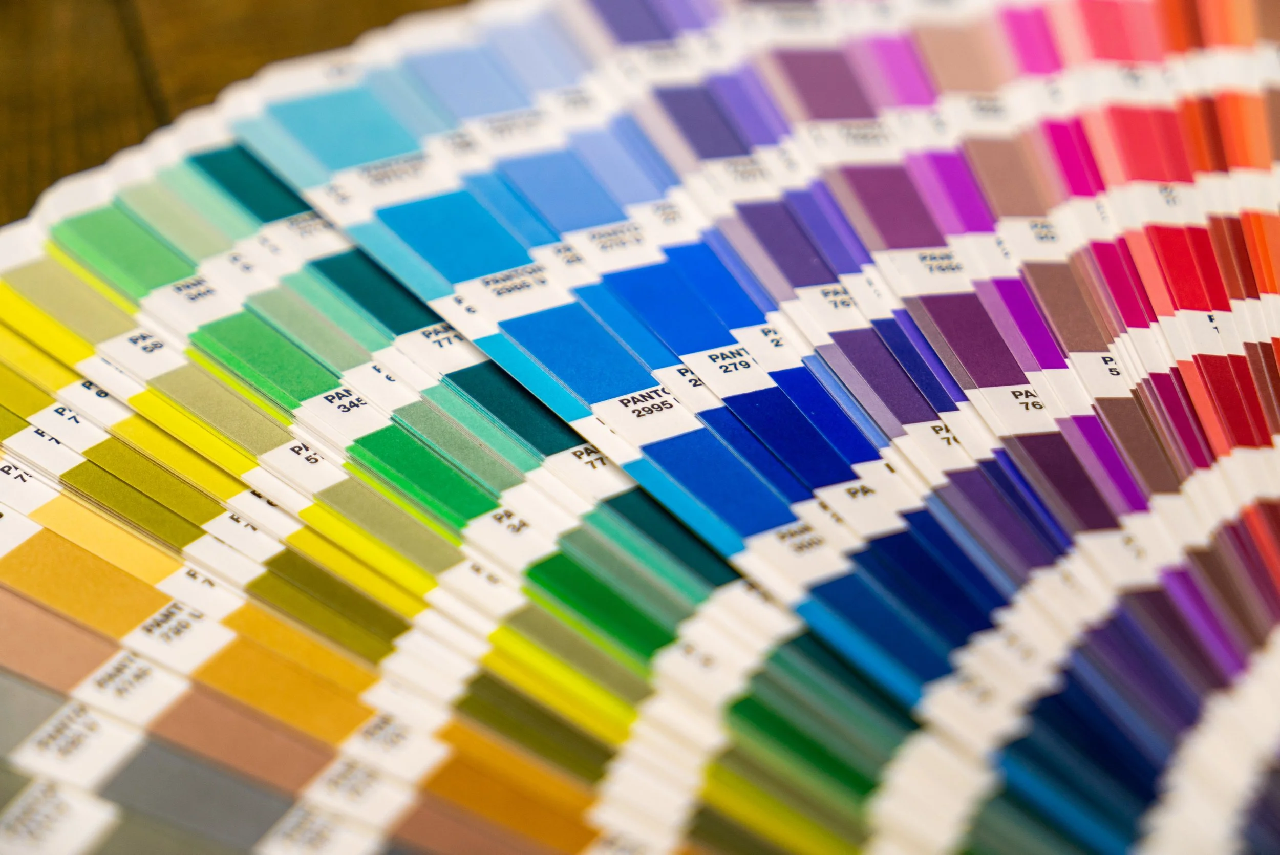
A healthy human eye has three types of cone cells, each of which can register about 100 different colour shades, therefore most researchers ballpark the number of colours we can distinguish at around a million. That’s a lot of colours.
How do artists and designers narrow it down? How do they avoid making a rainbow mess every time they go to paint, draw, or establish a palette for a brand? Colour theory helps colour make sense and be more structured, which is nice considering how many options are available. Here’s a little information about the colour wheel, colour theory, and why it is so important to consider it before you start a project.
What is the Colour Wheel?
The colour wheel is a wheel with 12 colours surrounding it.
The three primary colours are placed in a triad, and the rest of the colours fill in around them, as they all come from the three primary colours.
The secondary colours fill in between the two primary colours that create them.
The last six colours are the intermediate colours, or the tertiary colour previously mentioned. These colours comes from mixing a primary colour with an adjacent secondary colour (for example, blue and violet mixing to create blue-violet). These new colours are placed between the primary and secondary colour.
All of these colours together create a 12 colour wheel which can be used to visualize colour matches, comparisons, as reference on how to mix different colours, and more.

Source: 99designs
Important Colour Terminologies You Should Know
Hue
Hue is another name for colour. For example, an apple’s colour, or hue, may be red or green. Colour and Hue are two words that can be used interchangeably.
Chroma
Chroma is the purity of a colour. A colour with high chroma has no neutral colours - white, black, or grey - added to it, and appears more vivid and pure. Adding one of those neutrals to a colour reduces chroma and the colour then seems less vivid or bright.
Saturation
Colour saturation is the intensity or purity of a hue. When colour is fully saturated, the colour is considered in purest (truest) version. Once lightness level is set as constant, saturation is defined as a percentage that ranges from 0% (grayscale) to pure colour (100%).
Value
How light or dark a colour is. Light colours have higher values while darker colours have lower values. Black has the lowest value of any hue, while white is the highest.
Shade
A shade is a hue mixed with black, making it a darker version of the original colour.
Tone
Tones are created when grey is added to a hue. This makes it look more soft or dull than the original colour.
Tint
Tints are created when white is added to a hue, making it a lighter version of the base colour. Pastels are a good example of this because lots of white is added for them to appear so light.
Primary Colours
Red, yellow and blue. In traditional colour theory (used in paint and pigments), primary colours are the 3 pigment colours that cannot be mixed or formed by any combination of other colours. All other colours are derived from these 3 hues.
Secondary Colours
Green, orange and purple. These are the colours formed by mixing equal amounts of the primary colours.
Tertiary Colours
Yellow-orange, red-orange, red-purple, blue-purple, blue-green & yellow-green. These are the colours formed by mixing a primary and a secondary colour. That's why the hue is a two word name, such as blue-green, red-violet, and yellow-orange.
Warm/Cool
Draw a line through the centre of the wheel, and you’ll separate the warm colours (reds, oranges, yellows) from cool colours (blues, greens, purples).
What is Colour Theory?
Colour theory is both the science and art of using colour. It explains how humans perceive colour; and the visual effects of how colours mix, match or contrast with each other. Colour theory also involves the messages colours communicate; and this affects
What are the 7 different kinds of colour schemes?
The seven major colour schemes are monochromatic, analogous, complementary, split complementary, triadic, square, and rectangle (or tetradic).
Monochromatic
A monochromatic colour scheme utilizes just one colour with varying levels of saturation and value. In oil painting, many artists start with a monochromatic layer then build colour on top. This way, the value structure can be established without having to worry about multiple colours.
Analogous
An analogous colour scheme uses colours which are next to each other on the colour wheel. For example, blues and greens, or oranges and yellows. These colours have a close relationship with each other.

Complementary
Complementary colours are opposite each other on the colour wheel. When placed next to each other, there is an extremely strong contrasting and vibrant effect. If overused, your painting may become jarring and uncomfortable to look at.
You should select a dominant colour and use the other colour as an accent. In van Gogh's sunflower painting below, he used a dull background of blue to complement the orange for the flowers.
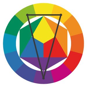
Split-Complementary
A split-complementary colour scheme utilizes a base colour and two secondary colours. It is similar to the complementary colour scheme, but one of the complements is split.

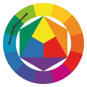
Triadic
A triadic colour scheme utilizes colours which are evenly spaced on the colour wheel. For example, yellow, blue and orange.
If using a triadic colour scheme, I suggest you pick a dominant colour and two secondary colours. Otherwise, it would be tricky to balance all three colours without it appearing jarring to look at.
Square
A square colour scheme is based on the principle of using evenly spaced colours. In addition, you choose the colour palette of this scheme type based on the position of the colour wheel.
To create a square colour palette, choose your favourite colour. Then you can identify the other colours that are at an equal distance from that colour. You have to count three spaces clockwise or counter-clockwise on the colour wheel to find the next colour for your palette, to which you will end up with two pairs of complementary colours.

Rectangular (Tetradic)
In addition to the square colour scheme, there is something similar called a rectangular colour scheme. A rectangular colour scheme is the richest of all available colour schemes because it gives you the most variety. But remember: creating such a scheme isn’t easy, and if you don’t choose the right proportions, the results can be unsightly.
Similar to creating the square colour palette, you can choose a colour you would like to appear in your colour palette and simply count two spaces on the colour wheel in either direction. The other two colours should be just opposite on the colour wheel.
Colour Palette Generators
In the end, choosing a colour palette is a complex and creative task. It helps determine brand perception - a colour palette can make or break it.